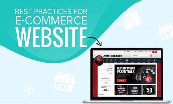
Design Features for Your eCommerce Store
Your eCommerce store is incomplete till it can find a way to retain and engage visitors. To accomplish this, merchants might want to create an aesthetic and easy-to-navigate eCommerce website. If your online store can ease the buying process, you’ll stand to receive a tremendous increase in revenue.
To achieve this, merchants might want to invest in specific design features to create a flawless interface for visitors. Users must find it easier to locate information. Such features will improve the way users interact with the eCommerce store and give them a memorable experience.
Store owners will be able to turn their average day-to-day visitors into loyal-lifetime users. Listed below are all the eCommerce design features every merchant must try to integrate into their eCommerce store.
Essential Design Features for eCommerce Websites
Search Wizard, Carousel Slides, Megamenu, Newsletter Pop-up, Product Comparison, Banners, Reviews, Help Desk
Add a floating helpdesk to as many pages of your eCommerce website as possible. Customers use the help desk to submit tickets about their orders. Any issues that emerge during or after placing orders can be explained in the form that pops up after clicking this widget.
Submitting the form will generate a ticket, a unique ticket number is generated, which is then forwarded to the customer via email and a representative in the support team. Merchants can also use the unique number to consolidate every message exchanged about that order.
Wishlist
Allow users to add their favorite products to a wish list. Furthermore, allow them to share the wish list with other users on the site and share the same on social media platforms. Wish Lists are a great way to create shopping lists or gift lists. Also, this handy tool can serve as a reminder about future purchases. Users can find the products easily in the future.
Call-to-action (CTA)
Convince your users to take some action on your site by displaying a bright, prominent, and eye-catching CTA on various pages of your eCommerce store. A CTA would involve some form of future contact.
Logically and Qualitatively place as many CTAs as you can throughout the site. Uses shouldn’t have to navigate over to the “Contact Us” page or to a form to get in touch with a pivotal person in your company.
Search Wizard
Not everyone likes to click on a list of links to locate their favorite items. They might want to type it in and get to the product immediately. In this scenario, browsing through the site stalls their desire to purchase. Hence, merchants would need an advanced product finder on their website.
The search wizard will scan, analyze, and display vast volumes of related data in near real-time. Not only that but, it’ll also pull relevant data as soon as the customer starts typing (minimum three characters). The user would also get the option to view all the results for the typed search query.
Carousel Slides
Although not applicable to every eCommerce business, it is a very effective way to captivate visitors right off of your home page. Merchants can showcase top-selling products and other promotions to capture user attention. This feature is known to be impactful and informative.
Integrating this into your eCommerce store doesn’t take a lot of effort. Plus, it gives merchants a chance to present prominent information as soon as visitors land on the homepage. Present dazzling and persuasive imagery of your SKUs that tempt users to click, visit its product page, and purchase them.
Megamenu
A sophisticated mega menu that neatly lists all your products into different categories and subcategories will be incredibly useful for your users. Visitors will be able to easily browse through the site by merely navigating further in the mega menu. More than anything, it elevates the visitor’s user experience.
Newsletter Pop-up
One of the ways to keep in touch with your loyal customers is through a newsletter. Add a pop-up to the home page that gets triggered after a while. Any visitor to your store must get to see them as a pop-up. The pop-up will collect an email address and forward information on deals, sales, trends, and other interesting data.
Newsletters are the best way to attract customers to your store. Even unregistered customers might convert upon seeing a brilliant deal in the email. Merchants get to engage users with trivia, tips, and general eCommerce news as well. Newsletters are the best way to nurture a relationship with your target audience.
Product Comparison
Now and then, users might feel the need to compare two or more products to decide which suits them best. In this scenario, having a product comparison tool simplifies their dilemma and eases their decision-making process.
Being able to analyze multiple products on various aspects will give users a better understanding of their choices. Users should be able to compare along, color, dimensions, weight, price, and much more depending on the industry. Allow customers to get the best overview of the technical details of various products.
Banners
The use of banners on the home page, especially animated ones, is known to capture visitors’ attention. Feature anything you want, but ensure the content looks as bold, dynamic, and colorful as possible. Stylish and visually appealing banners get high visibility.
Anything included in the banner will not go unnoticed by visitors. This allows merchants to have top-selling products, anything on sale, or even a countdown timer to create urgency. One thing is for sure that users will get tempted to click. As a result, it is quite likely that your order placements will skyrocket.
Reviews
eCommerce store owners can reserve a section on their homepage to display reviews and positive testimonials with ratings. Visitors will immediately feel a sense of faith and see the credibility in associating with you. Therefore, any visitor that comes across this is more likely to place orders on the site. Genuine and honest reviews make the brand seem more trustworthy to the visitors.
- Design Features For eCommerce Website - Tips & Tricks
adam@onlinewebdesign.co.uk

Web Design To Boost Up Revenue
A good web design is one of the vital factors to increase your sales and traffic swiftly. Every feature of your business website counts in providing a seamless experience to the users.
Learn More
360 Degree Marketing
Most people have heard of 360 degree marketing in passing yet do not fully understand this unique approach to converting prospects into paying customers.
Learn More
10 Factors Small Website Must Have
A small business website design should be simple yet captivating. Too much information or a complicated design can overwhelm the viewer.
Learn More
10 Top Google Ranking Factors
While paid search ads are a great way to gain immediate exposure on this go-to search engine, you should also be working to build up your organic rankings as well.
Learn More
Why you need an SSL certificate
Websites need SSL certificates to keep user data secure, verify ownership of the website, prevent attackers from creating a fake version of the site, and convey trust to users.
Learn More
Improve With Google
Google has become a part of almost every individual's life in different forms and for different purposes. When it comes to managing and marketing of businesses.
Learn More
Website Speed Optimization
In business, speed is imperative, whether it’s getting your product to the market or reaching your customer before your competitor does. This rule of speed applies to your website’s loading time too.
Learn More